
Interiors Layering 101: Your Credenza 3 Ways

As Spring arrives it is exciting to see what trends emerge, and unsurprisingly the notion of layering has stayed true even in 2024. For those who may not be familiar, the idea of layering can be interpreted in many different ways. I like to look at it as the concept of intentionally adding layers of content into a space, and accentuating certain layers. Hence, they stand out more, making the space look more full and lively but still cohesive instead of cluttered, giving a small nod to the resurgence of Maximalism. It is no secret that I lean more towards Minimalism than the latter, but creating interiors means you have to challenge yourself to create things that you wouldn’t normally do, plus it’s fun to see if my home can accommodate this kind of trend! I opted to use the credenza as our sample space because it is so flexible, being just a large flat surface. You’ll notice quickly in each look I’ve included our record player and speakers, knowing that like most furniture, your credenza may also house appliances and entertainment systems like ours does, so there’s an extra challenge of making these looks cohesive with the player. I wanted to share how with some intentional inclusions you can make your style shine through, whether it be through modern, vintage or colourful taste, let’s dive in!


Colourful Confidence
This look is just that, confident! If colour is your thing this is a great formula to get you started. When layering I like to start with my colour palette, especially with one that is more colourful. I opted for a collection of jewel tones and bright fun colours including pink, green, navy and yellow. I find these colours play well together and can create a lovely sense of whimsy. As I begin to layer, I like to start with the biggest items first, otherwise known as the non-negotiables. For this look, I wanted to have the records on the credenza (in a repurposed folder stand) so that I could use the cover art to add to this theme. The album art of Widowspeak’s ‘Plum” was a perfect addition to the palette! From there I head over to lighting, which was extra fun as I get to debut my new mushroom light! Adding a lamp, especially in a dark corner, adds a sense of space to the area you’re styling. I’ll then start layering in books as a way to ground the content that goes on top, in this case, a few bottles and dishes and some fun fake flowers to keep the vibe going. I also wanted something on top of the record player to carry your eye across so I added our chess board. I love adding checkers with bolder pallets as it brings a sense of personality without being distracting. Lastly, I like to add in art, ensuring that whatever is included works cohesively with the rest of the look. I opted for a painting my grandmother had done, and a print I picked up while travelling as they both are playful and colourful!


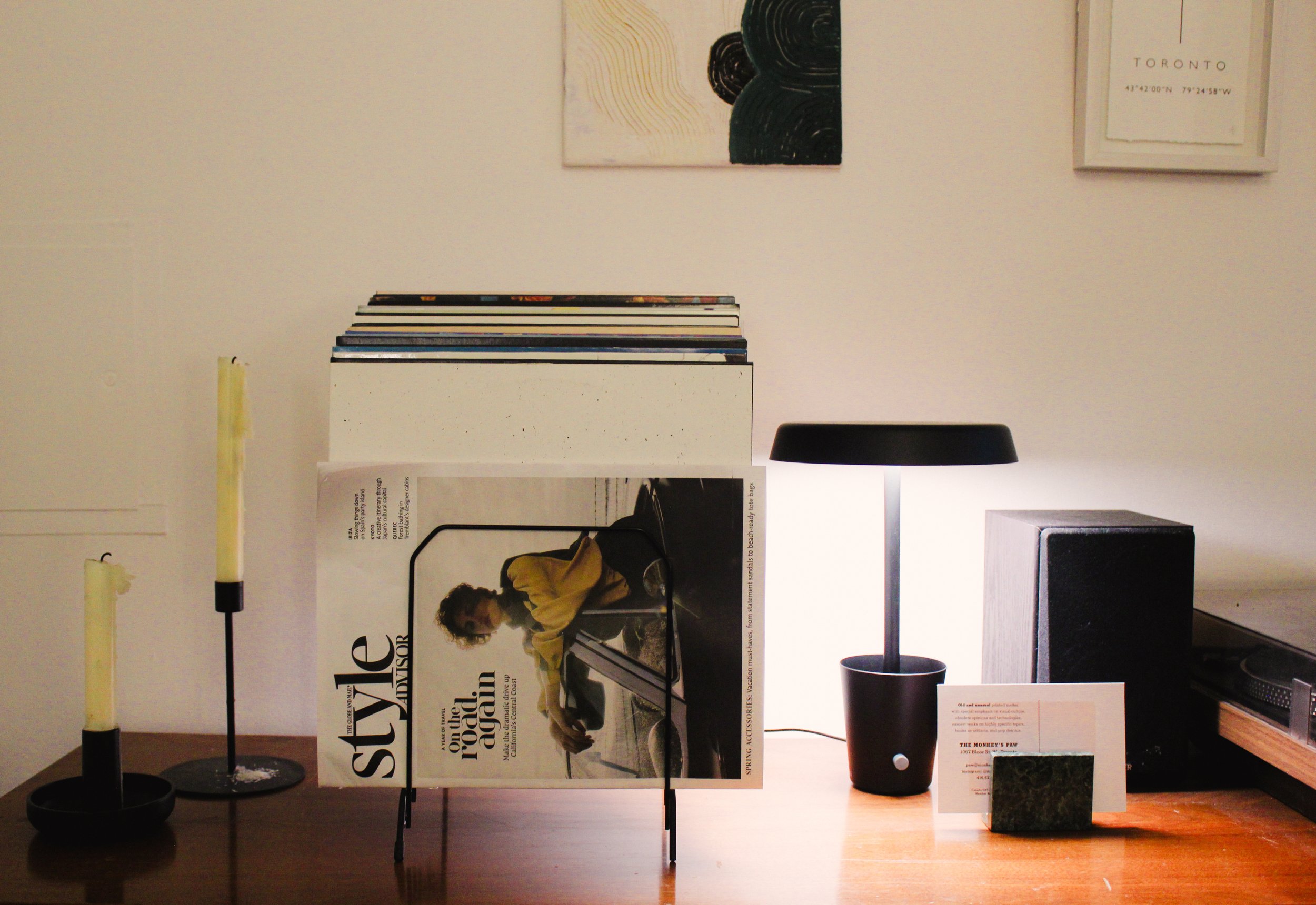
Modern Aesthetic
This look I would say is the most paired back of the three, but for good reason, we’re going for Modern this round! As before, we begin with the pallet. For this look, I opted for more neutral tones including white, black, and green. Knowing that this look is more modern I didn’t feel like it needed a wild pallet as a lot of its engagement comes from the unique shapes and hard finishes. I then moved on to non-negotiables, for this one I kept the record stand but switched out the record in front for a neutral one and added a magazine in front with a classic typeface. I then added this lamp which I am also very excited about because it’s got hard modern edges but isn’t visually demanding. I also opted to include a few taper candles which again are very simple and the long stem pairs well with the neck of the lamp. I then added my accents which for this look I opted for stone, including a vintage marble business card holder and a stone statue that was my grandmother’s. I love this layer because it adds polish without being overbearing. Finishing with art I went for a painting I did with high texture, and two prints that both lean into the pallet while having clean lines, creating a modern layered moment!


Very Vintage
This look was so much fun because it meant I could pull out my quirky vintage decor! This look is a little different than the rest because the palette is really only two colours, white and wood, which though seems arguably easier, I would say it’s more difficult because you run the risk of everything blending together. To help avoid this, I started with my bigger piece, our vintage radio, which is still on theme with the record player but a little different than the rest. I also included a large vase of hyacinths as a non-negotiable since the look needed some green to make it feel more alive. I also added this lamp which is reminiscent of gaslights, aligning with our theme and palette. Once set, I got to work on adding in the base layer, which in this case was the book underneath the radio and a marble coaster under the hourglass. By adding these you ensure that the wood objects don’t simply blend into the credenza. I then added the small items which in this case are the box, candle, dishes, hourglass and candle doubter/snuffer. All of these have unique character to them that are subtle but present. I especially love the candle doubter as it’s made of copper and brass and is very much a vintage piece! I finish the look with simple art this time, a small floor rug put on the wall! Adding texture like this on your walls is a great way to add depth to your look without taking away from the furniture and details themselves.
Now that you’ve got the recipe, I hope to see what looks you create!
Want more interior inspiration? Check out our Interiors section and our Instagram to stay in the know.